
Designing for Kids
A kid-friendly learning platform with kid-friendly access
THE CHALLENGE
To create a visually engaging platform experience for K-2 students
MY ROLE
UX Design
TEAM
TPM, Engineering Lead, Business Stakeholders, UX Researcher, Illustrator
TIMEFRAME
2016-17
Background
Our Open Learning platform was designed in a way to keep things consistent for Teachers and Students. This was useful when Teachers had to guide students through certain parts of the interface.
However for young learners, the UI was not only complicated, but also lacked the sort of an experience that would keep them engaged.
McGraw Hill has several kid-friendly products and helped inform our research and strategy into designing for kids.
Simplified Login
One of the first things I tackled was the idea of creating a simplified login experience. Using emails and complex passwords wasn’t going to work with young learners and we needed some sort of a visual method to login.
One of our existing products was already using a pictorial form of login which worked well. However, it had some security concerns.
I collaborated with our Engineering and Security leads to understand how we could use the existing pictorial login system while updating it to make it more secure.
Wireframes to document the overall login experience


Cognitive Considerations
Before thinking in terms of visuals, it was important to look at past research and strategies that have influenced successful products for kids.
Along with another designer, we put together a set of guidelines to inform our design decisions.
This document contained guiding principles, dos and don'ts and examples that would help define our approach and also keep us grounded as the project evolved.
Screenshots from our “Designing for Kids” documentation
“Children’s cognitive skills are still developing, so their reasoning abilities are weaker than those of adults. To help them successfully use an interface, designs should display clear, specific instructions, leveraging kids’ mental models and prior knowledge.”
— Feifei Liu, Nielsen Norman Group
Concepting
Having establishing some design principles and considerations, I was ready to focus on creating a visually engaging learning experience. My goal was to come up with multiple concepts based on the guidelines we had outlined earlier in the project.
Explorations for the Login screen


Class experience concepts


End-to-end Prototyping
Discussions with Product, Business, Marketing and Engineering stakeholders helped me pick a design direction.
I built a clickable prototype in InVision including all the screens in the end-to-end student experience.
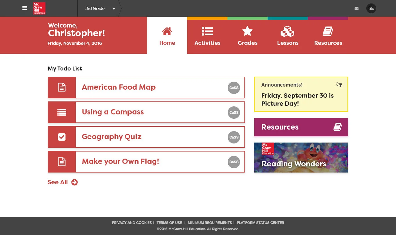
Screenshots of a working prototype (HTML/CSS + Bootstrap)


Teacher Feedback
Before getting feedback from students directly, we wanted to make sure we get some second-hand insights from teachers.
In many cases, teachers help their students when using a digital learning platform. They are uniquely placed to understand the challenges their students face and provide feedback on how we can improve.
In partnership with our research team, we conducted interview with 9 teachers who provided feedback on a clickable prototype in an online, moderated activity.
Educators described their overall impression of the prototype as “clear and easy to use,” “crisp and clean,” “straightforward,” and “streamlined.”
Kids Community
The first round of feedback from teachers helped me finetune my concepts. Updated designs were used for testing with students.
Our research team worked with 17 students in grades K through 5 who provided feedback on the clickable prototype during moderated user test sessions.
During the sessions, the moderator provided the student with eight tasks to complete:
Log in using the simplified credentials
Navigate to a lesson page
Navigate to Chapter 2
Navigate to the activities list
Submit the activity
Review past work, and
Navigate to the grades page
We received mixed feedback from the student sessions. While the simplified login and activities’ tasks were overall successful, students faced the most challenges with the content side. The content screens were owned by a separate team who continued to make improvements on the experience.
Screenshots from the research reports


Pilots and Launch
In the fall of 2017, we did a pilot launch of this experience as part of our California IMPACT Social Studies program.
We received positive feedback from the pilots and continue to make improvements and release new features.