
Building an Accessible Design System
Strategies and processes to help build inclusive components
THE CHALLENGE
To design and promote the use of accessible UI components across our platform
MY ROLE
UI Design & Strategy
TEAM
Accessibility Specialist, Engineers, Designers
TIMEFRAME
2018-19
Background
Our previous design system, meant to help designers and developers build consistent experiences across our platform, was not optimized for accessibility.
As an EdTech company, McGraw-Hill is committed to building products that can be accessed and used by all learners, including those with disabilities.
Our goal was to be compliant with WCAG 2.0 AA guidelines with a focus on student users.
Understanding Accessibility & Inclusivity
Web Accessibility has been gaining more ground in software development. According to the World Disability Report (2011), more than 13% of the world’s population lives with some form of disability.
Understand what compliance meant and the scope of the task at hand was crucial. Through a comprehensive strategy that included planning, research and company-wide training, we familiarized ourselves with the relevant topics to help us move forward.
“The power of the Web is in its universality. Access by everyone regardless of disability is an essential aspect.”
— Tim Berners-Lee
W3C Director and inventor of the World Wide Web
“We want accessibility for an inclusive society, made up of individuals who see what lies ahead of disabilities: people. Understand what lies behind disabilities: lack of technology, knowledge, and attitude. Every disability has a solution waiting to be discovered. Accessibility is already there, looking at everyone and waiting to be applied.”
- Marco Antônio de Queiroz
Blind and expert web accessibility consultant
A Starting Point
A design system had emerged as an outcome of a past project, which was adopted as a global design system for our platform. This proved to be a good starting point for us as we delved into accessibility.
The fact that designers and developers were already using a shared system, helped us focus our efforts on the existing system.

Glimpses of our previous design system
Defining Requirements

Example document for requirements of a component
Led by our Accessibility Implementation Manager we defined the requirements for each of the UI components. These requirements also included mouse, keyboard and screen-reader behavior expectations.
As we worked through the requirements of various UI components, I identified some key themes to inform our approach to accessibility:
# Balanced
While addressing accessibility and usability, it was also important that the visual design retained the aesthetic aspects of our brand.
# Empathy
To be able to design accessible components, it’s important to understand our users and how they would interact with our system. Familiarizing ourselves with assistive technologies like screen-readers helps us empathize with our users.
# Consistency
It is important to ensure that components that repeat over the interface are presented in the same order or follow the same operating patterns.
Key Design Considerations

Screenshot of part of our A11Y checklist
While our compliance commitment is to the 2.0 guidelines, we decided to push for the recently drafted WCAG 2.1 guidelines. After reading through the documentation, our Accessibility Implementation Manager helped define an Accessibility Checklist.
I focused on the items pertaining to visual design to help us get started on updating the UI components.
# Make sure keyboard focus is visible.
# Minimum contrast ratio of 4.5:1 between text and background.
# UI elements and Graphics must have a contrast ratio of 3:1 against their background.
# Don't rely solely on color to present information.
# Use icons and buttons consistently.
# Text can be resized 200% without loss of content or function.
# Content can be enlarged up to 400% without requiring dimensional scrolling.
UI Design
Adopting the WCAG 2.1 guidelines was a way to future-proof our design system.
The biggest challenge with the new guidelines was the contrast ratio for all interactive elements on the page. This included not only the focus, but the default state of elements like Buttons or Input Fields.
The exercise began with the visual design of Inputs and Buttons, the basic components within our system. Soon I was looking into more complex components like dropdowns, toggles, tooltips and popovers.
While I started with designing components at a zoomed-in level, I quickly switched over to trying them out on existing application pages to get a sense of the overall look and feel.

An option for design of the form elements

Another option for form elements (we ended up going in this direction)
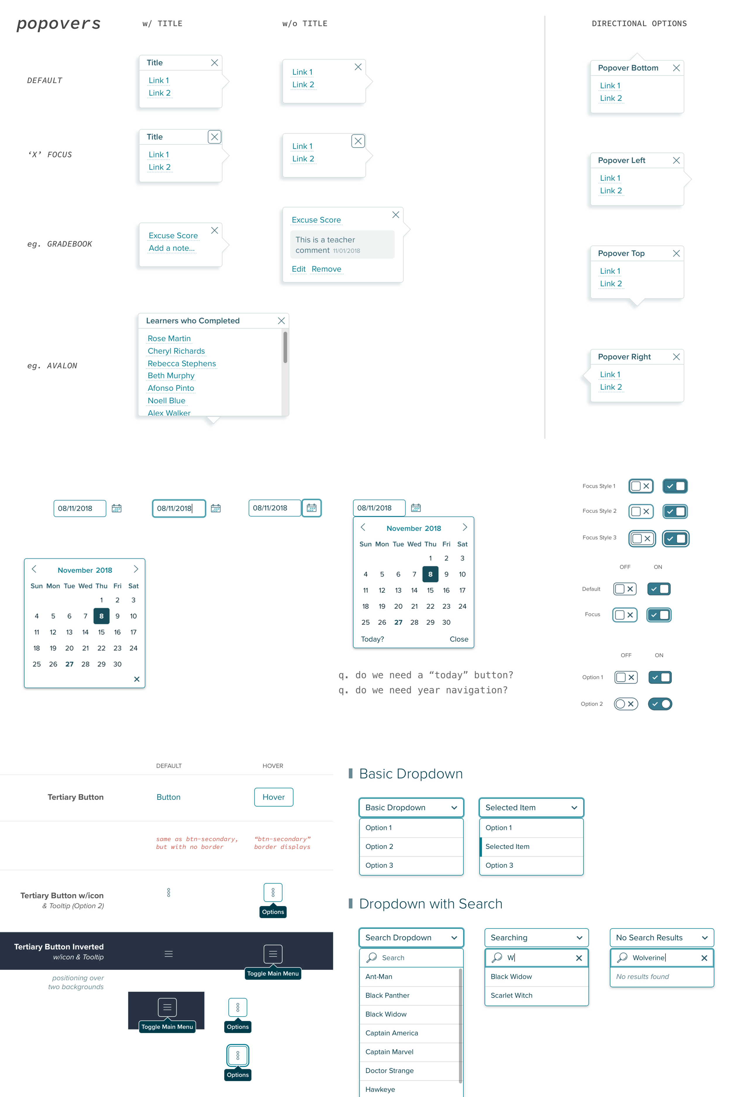
Explorations with various components

Approved set of form related UI elements
Review, Build, Test & Iterate
Designers and Developers were part of the design process along with Accessibility and Product stakeholders. Once my proposed designs were approved, it was time to provides specs and other details to help with the implementation. The combination of Sketch+InVision helped us through the handoff process.
Developers followed their own checklist based on recommended UI development principles for accessibility.
More complex components like Tooltips and Popovers were tested with screen-readers after being built in order to get the full experience and plug any gaps that may have been missed during the design or development processes.

InVision’s “Inspect” mode for developers to grab specs
Updating the Documentation

Proposed design for the landing page
Going through this process, I strongly felt that we needed to support the updated designs with robust documentation to help both Designers and Developers make the right decisions.
I got started by gathering information from other design system documentation websites. Material Design, Carbon Design System, Shopify and Atlassian were some of the sites that inspired me.
Having done the research, I identified the need to include the following:
# Layout Guidelines
This would convey a components recommended position with respect to the page or any kind of content.
# Content Guidelines
Offer guidance on the appropriate use of variations of the single component. This would also include any recommendations on copy if applicable.
# Examples
Showing the right as well as the wrong usage of components would help clarify their purpose.

Documentation for the “Alerts” component - Developer information

Designer guidelines on how to use the “Alerts” component

General examples showing right and wrong usage
Outcomes
The new designs successfully passed compliance evaluations that were run by an independent company called Level Access.
We had the foundation of a new documentation site. This was going to be an ever-evolving product with contributions from multiple people. That effort is still ongoing.
Improved design processes meant that our handoffs included greenlines. I also created a database of tools and plugins like contrast-checkers that would help during the design process.
In order to build a recurring feedback method, I asked our Researcher to find an organization who would like to partner with us on conducting usability sessions with assistive technologies. This led to a partnership with the Braille Institute in LA, and we’ve worked with their Instructors on a consultancy basis a couple times.
Takeaways & Learnings
This project was enlightening for me as it made me rethink our approach to interaction design.
Here are some of the things I intend to keep in mind going forward:
# Beyond Components
Having a design system with accessible components does not guarantee that your application will automatically be accessible. Solutioning needs to happen at the holistic application level in order to build a truly inclusive product.
# Test Frequently
Iterative building and testing of components is crucial for accessibility. No one can guarantee an accessible experience just through static mockups. Experiencing how a screen-reader user would interact with the application really helps understand the context. This gives us the opportunity to revisit the design or implementation to plug any gaps in the experience.
# Scope for Interpretation
While some guidelines are straightforward, like color contrast, there may be cases where you may find multiple ways to make a component accessible. In such cases, it’s critical to explore all options before picking the one that best fits our use case. Equally important is to be consistent in such decision making across the platform.
Of the many challenges that exist in the world, using digital products should not be one of them.